A good KPI dashboard answers one question in five seconds: “how are we doing?” Too often, though, the numbers that answer that question are scattered across multiple tabs, buried in raw data, or only understood by whoever built the spreadsheet. A KPI dashboard in Google Sheets fixes that — pulling your key numbers into one clean, visual summary that updates automatically as your underlying data changes.
Here’s how to build one, step by step, without needing any add-ons or paid tools.
Step 1: Decide Which KPIs Actually Matter
Before opening a blank sheet, get clear on 4–8 metrics that genuinely drive decisions. Common examples depending on the business:
- Sales/revenue: total sales, average deal size, conversion rate
- Pipeline: leads by stage, pipeline value, time-to-close
- Operations: tasks completed, turnaround time, error rate
- Marketing: leads by source, cost per lead, campaign performance
The most common dashboard mistake is trying to show everything. A dashboard with 20 numbers on it isn’t a dashboard — it’s just the raw data with better formatting. Pick the handful of numbers someone would actually check weekly.
Step 2: Separate Raw Data from the Dashboard View
Your dashboard should never contain raw data directly — it should pull from it. Set up your spreadsheet with at least two tabs:
- Raw Data tab(s): where individual records live — every sale, every lead, every task, one row per record
- Dashboard tab: a clean, formatted summary that calculates and displays KPIs from the Raw Data tab
This separation matters because it keeps your dashboard stable and readable even as the underlying data grows to thousands of rows. It also means anyone updating raw data doesn’t accidentally break the dashboard’s formatting.
Step 3: Calculate Your KPIs with Formulas
With raw data structured (consistent columns, one row per record, clean headers), you can calculate most KPIs using a combination of:
- SUM / SUMIF / SUMIFS — for totals, and totals filtered by category or date range
- COUNTIF / COUNTIFS — for counting records meeting specific conditions (e.g., leads in “Closed Won” stage)
- AVERAGEIF — for averages within a category (e.g., average deal size per rep)
- QUERY — for more complex summaries, like grouping and aggregating data in one formula
For example, total pipeline value by stage might look like:
=SUMIF(RawData!C:C, "Underwriting", RawData!D:D)This pulls the sum of loan amounts (column D) where the stage (column C) equals “Underwriting” — recalculating automatically every time new data is added.
Step 4: Visualize with Charts, Not Just Numbers
Numbers alone are useful, but a chart makes trends and outliers immediately visible. A few chart types that work particularly well on KPI dashboards:
- Line chart — for tracking a metric over time (weekly sales, monthly leads)
- Bar chart — for comparing categories (leads by source, sales by rep)
- Donut/pie chart — for showing proportion (pipeline value by stage)
- Scorecard-style big numbers — a large, bold number with a label is often more effective than a chart for a single headline metric (e.g., “Total Pipeline Value: $2.4M”)
In Google Sheets, select your summary data and use Insert → Chart, then adjust chart type and formatting from the Chart Editor panel.
Step 5: Add Conditional Formatting for At-a-Glance Signals
Conditional formatting turns your dashboard from “here are the numbers” into “here’s what needs attention.” Useful examples:
- Red/yellow/green formatting on a conversion rate cell based on target thresholds
- Highlighting any KPI that’s dropped compared to the previous period
- Flagging metrics that are missing data (blank or zero when they shouldn’t be)
This is what lets someone glance at the dashboard for five seconds and immediately know whether something needs a closer look.
Step 6: Keep It Updating Automatically
A dashboard that requires manual refreshing tends to go stale within a few weeks — someone forgets, or it’s not a priority during a busy stretch. A few ways to keep it current without manual work:
- If your raw data comes from a CRM (like Bonzo or GoHighLevel), sync it directly into your Raw Data tab so new records appear automatically
- Use
QUERYandSUMIFSformulas (rather than static Pivot Tables, which sometimes need manual refreshing) so the dashboard recalculates live as data changes - If you want the dashboard emailed on a schedule, Google Apps Script can generate and send a snapshot automatically
A Simple Example Layout
A clean, single-page dashboard might be structured like this:
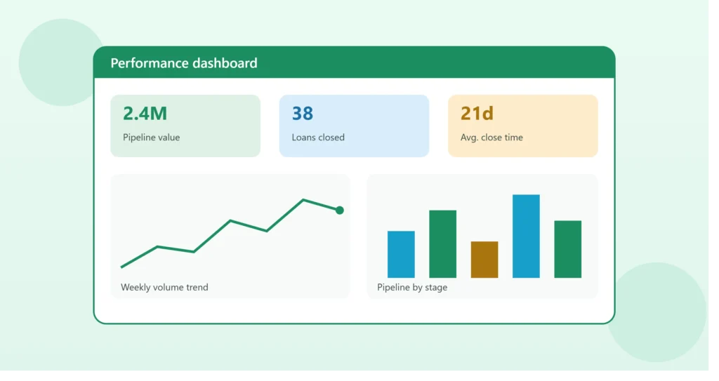
Top row: 3–4 scorecard numbers (Total Pipeline Value, Loans Closed This Month, Average Time to Close, Conversion Rate)
Middle section: A line chart showing weekly volume trend, next to a bar chart showing pipeline by stage
Bottom section: A small table listing loans that need attention (flagged via conditional formatting) — the “so what do I do next” section
This structure covers the three things a good dashboard needs: the headline numbers, the trend, and the action items.
Common Mistakes to Avoid
Mixing raw data and dashboard on the same tab. This makes the sheet fragile and hard to maintain as it grows.
Too many colors and chart types. A dashboard trying to look impressive often ends up harder to read than one built with restraint — pick a simple color scheme and stick to it.
No clear “so what.” Numbers without context (is this good or bad?) aren’t actionable. Targets, comparisons to the previous period, or color-coded thresholds give the numbers meaning.
Building it once and never revisiting it. As the business changes, the KPIs that matter can change too. Revisit the dashboard every few months to confirm it’s still showing the right things.
Getting Started
You don’t need to build the perfect dashboard on the first try. Start with 4–5 KPIs, a clean raw data tab, and a couple of charts — then expand once you see what people actually use and what they ignore.
If you’d like help designing and building a KPI dashboard tailored to your own data — whether it’s pulling from Excel, Google Sheets, or a CRM like Bonzo or GoHighLevel — book a free 15-minute call and we’ll map out what your dashboard should include.